Pentagram worked with Reddit to evaluate its brand positioning with fresh eyes and create a cohesive set of brand methodologies for the future—all while preserving the company’s signature sense of conviviality and joy. As one of two lead designers on this project, I played a key role in shaping Reddit’s visual identity, ensuring it aligned with their evolving brand values.


Pentagram wanted to highlight the unique role that comments play in the Reddit universe. (...) To highlight this, the design team introduced a conversation bubble as the new cornerstone of the brand’s visual identity. Starting with the 'Reddit' wordmark, the team customized Reddit Sans, one of the company’s proprietary typefaces, turning the rounded counter forms of lowercase letters into bubbles as a nod to Reddit's interface.
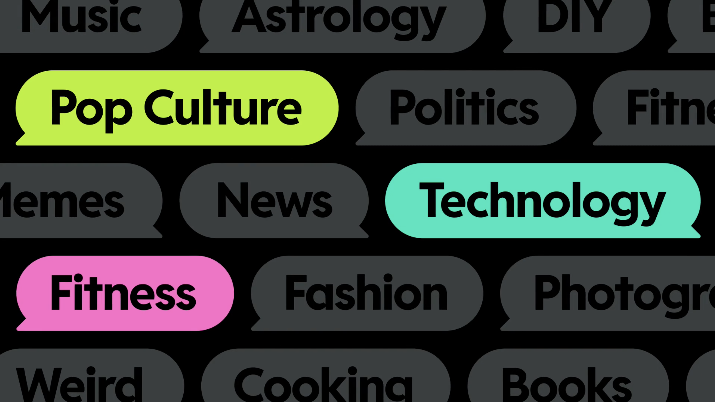
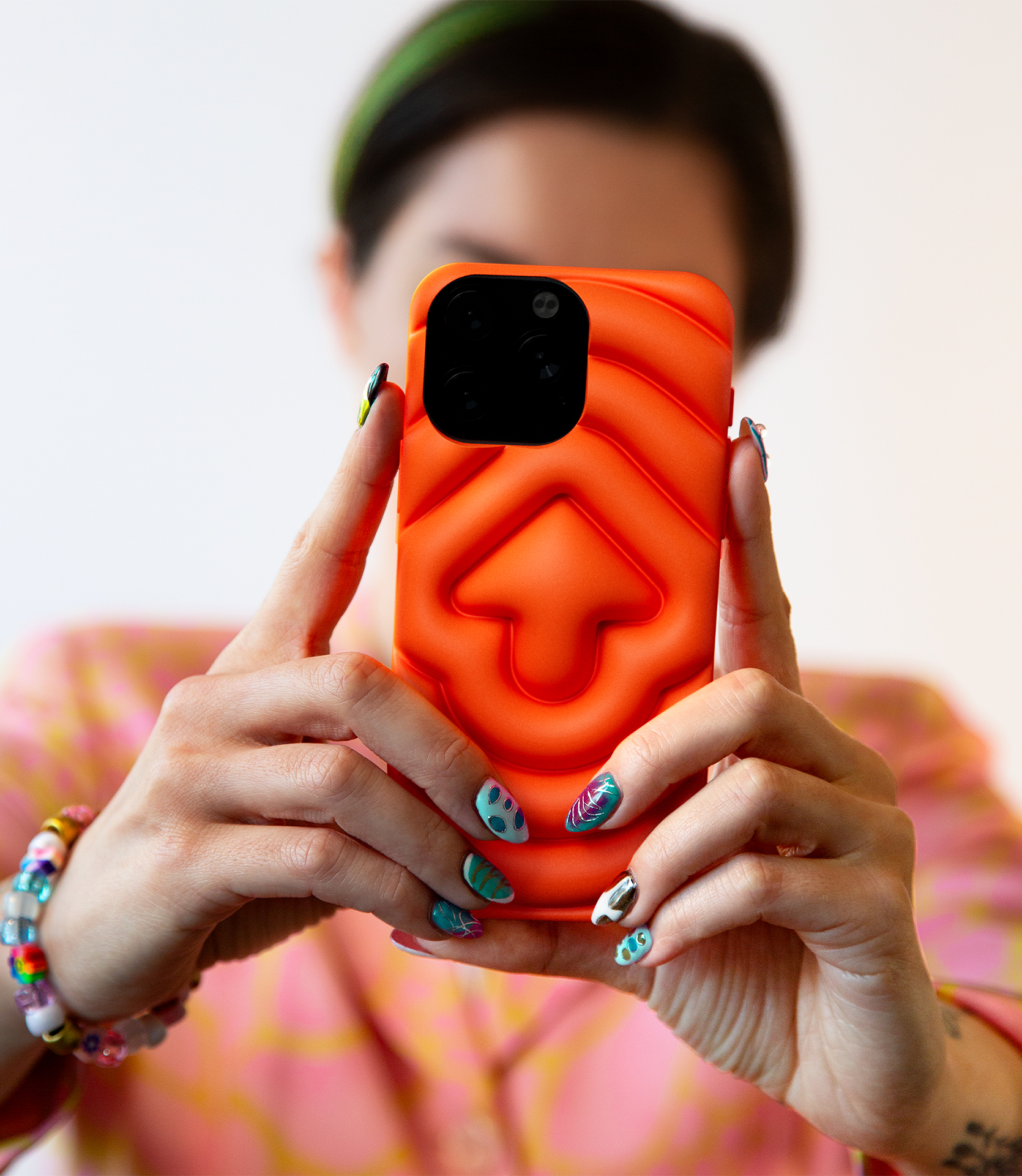
Beyond typography, the bubble became a key element of the compositional strategy. Engineered as a dynamic content device, the bubble adeptly frames both text and images, acting as a foundational graphic element. Its ability to adapt and shape-shift underscores and celebrates the essence of Reddit’s communities, content, and unique vernacular, making it an integral part of Reddit’s distinctive visual language.
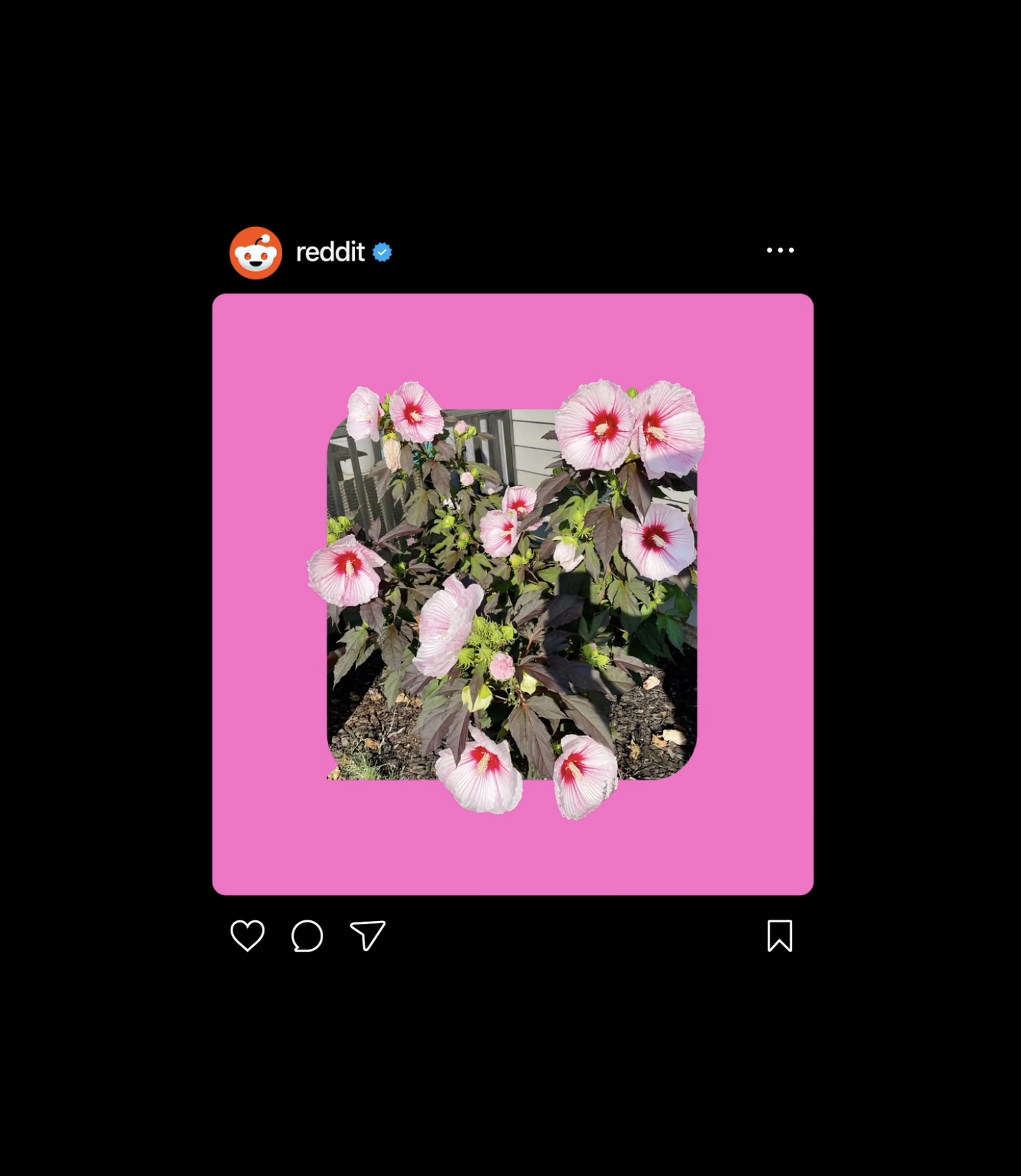
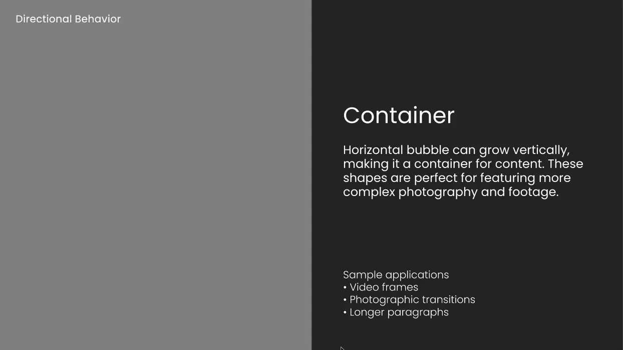
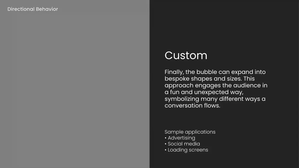
Once the bubble was established as an anchor point in the identity, the design team married it with motion to provide extra utility to Reddit’s brand team. (...) These motion behaviors mimic sliding drawers and doors, and give Reddit’s team a methodology for organizing and revealing content in a codified way.
The strategic integration of these key refinements—the evolved form and expression of Snoo, the introduction of the bubble, the creation of Reddit Display, codified motion behaviors, and a streamlined color palette—collectively reflects Reddit’s unique brand attributes and empowers the company to confidently navigate its next chapter.
